SharePoint Web Parts Essentials
 CNX Icon Studio
Give your organization one brand icon library in SharePoint: find, recolor and export Fluent UI and custom icons, and create new ones with AI.
Overview
CNX Icon Studio gives your organization one place in SharePoint for its icons. Browse about 2,800 Fluent UI System Icons alongside your organization's own icons, search by name or tag, recolor them with solid colors or gradients, and download, copy or email them in the size and format you need.
Your own icons are stored in a SharePoint list on your site. Upload the SVG files you already have, combine two icons with a badge, and save new designs as personal, draft or published, so your collection grows with your brand.
When the icon you need doesn't exist, AI can create it: describe it, combine up to three existing icons, or convert an image, and AI draws three options in the Fluent style for you to refine. AI is optional: browsing, customizing, uploading and exporting icons all work without it.
Features
One icon library
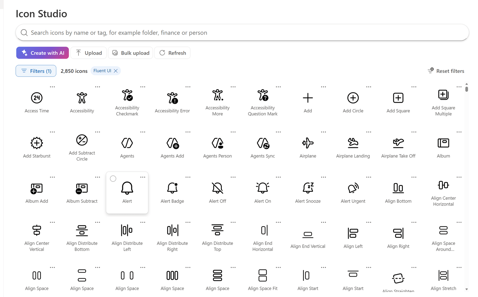
About 2,800 Fluent UI System Icons, in Regular, Filled and Colored styles, and your organization's own icons appear in one searchable gallery, with your icons first. Type in the search box to filter by name or tag as you go, and use Filters to show a style, a source, or only the icons you created.
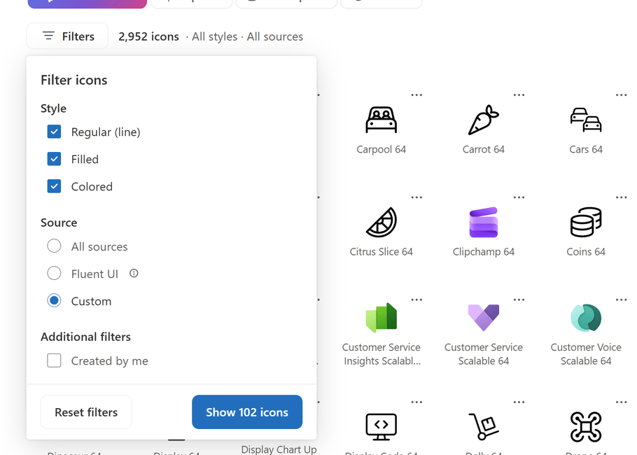
Filters combine as you'd expect: choose any of the three styles, All sources, Fluent UI or Custom, and Created by me, then select Show to apply them.
Make it on-brand
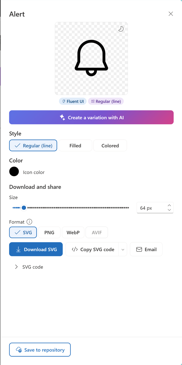
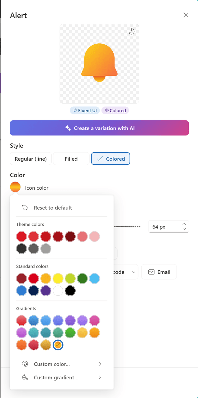
Select an icon to open its details. Switch between its styles, preview it on a light or dark background, and recolor it with a solid color, one of the gradients or a custom gradient of your own.
The Icon color picker offers your site's theme colors, standard colors and gradients, with Reset to default to go back to a colored icon's own palette.
Use it anywhere
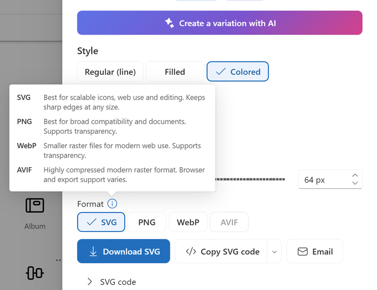
Download an icon as SVG, PNG, WebP or AVIF at any size from 16 to 512 pixels (several icons download as a ZIP file), copy its SVG code, or copy it as an image to paste into PowerPoint, Teams or Outlook. The information button next to Format explains which format to choose.
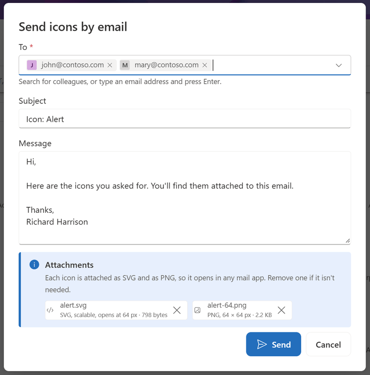
Or select Email to send icons straight from SharePoint: each one is attached as SVG and PNG, so it opens in any mail app. Up to 10 icons fit in one email.
Add a badge, without AI
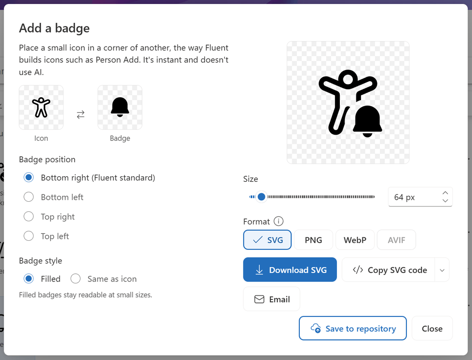
Select two icons and choose Add badge to place the second one, at half size, in a corner of the first, the way Fluent builds icons such as Person Add. Swap the icons, choose the corner and the badge style, then download, copy, email or save the result.
Upload your own icons
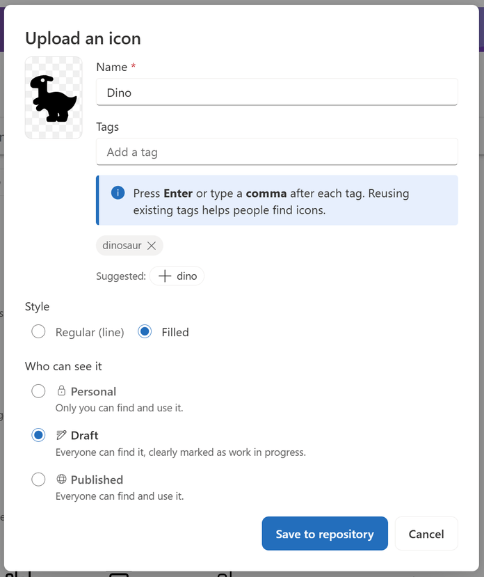
Select Upload to add an SVG file from another icon library or your designers. Name it, tag it, choose its style and who can see it. Every SVG is cleaned of scripts and links to other files before it's saved.
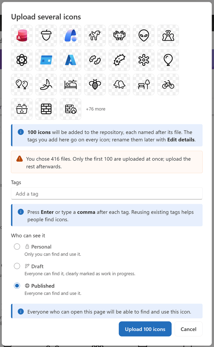
With Bulk upload, add as many SVG files as you like at once: each icon is named after its file, and the tags and visibility you choose apply to all of them.
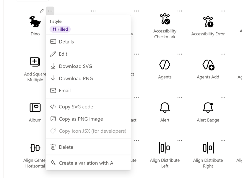
Right-click an icon, or select its More options (...) button, for quick access to its actions: details, edit, download, email, copy, delete or Create a variation with AI.
Create what's missing with AI
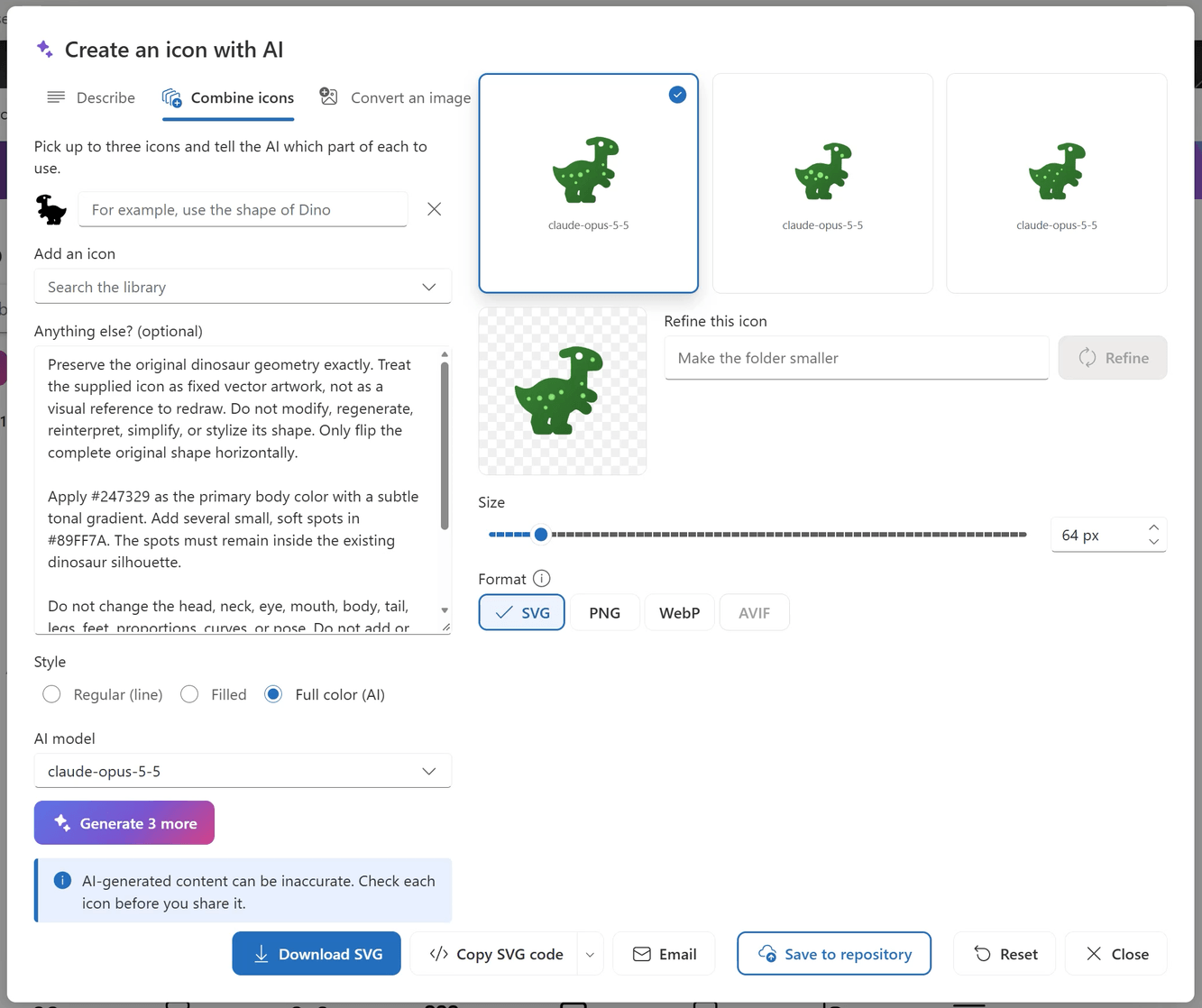
Select Create with AI and describe the icon, for example an accounts payable icon with an invoice and a check mark. While you type, Already in the library shows icons that might already do the job. Choose Regular (line), Filled or Full color (AI), and a model when more than one is available.
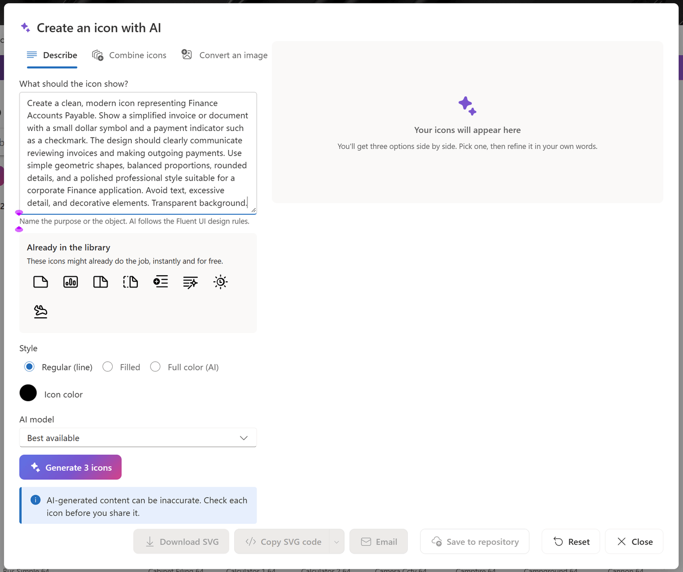
Or start from what you have: Combine icons uses up to three icons, each with its own instruction, and Convert an image turns a picture into an icon. AI draws three options side by side. Select one, refine it in your own words, convert it to full color, or generate three more, then download, copy, email or save it to the repository.
Govern the repository
Save icons as Personal (only you see them in Icon Studio), Draft (everyone, clearly marked as work in progress) or Published. Uploaded icons stay personal until someone with Edit or Full Control of the list shares them, so your published collection stays consistent.
Configuration
After the CanoeUX SharePoint Web Parts Essentials package has been deployed to your SharePoint tenant, you can add CNX Icon Studio to any modern SharePoint page and create the list that holds your organization's icons.
Step 1: Edit the page
Go to the SharePoint page where you want the icon library, such as a page of your brand site, and select Edit.
Important: The Edit button is in the upper-right corner of the page. If you don't see it, you don't have permission to edit the page: ask the site owner or a site administrator for edit permissions.
Step 2: Add the web part
Hover over the section where you want the web part to appear, select + Add a new web part, search for CNX, and then select CNX Icon Studio. A full-width section gives the gallery the most room.
Step 3: Open the property pane
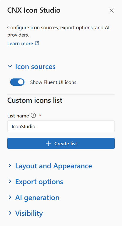
Select Open settings in the web part, or Edit properties in its toolbar. The property pane has four sections: Icon sources, Layout and Appearance, Export options and AI generation.
Step 4: Configure the Icon sources section
Expand Icon sources.
Available options
Show Fluent UI icons
On by default. Keep it on to include the Fluent UI System Icons in the gallery.
Custom icons list
Keep the default name, IconStudio, or enter a name that follows your naming convention, then select Create list. Review the confirmation, and select Create list again. Icon Studio creates the list, its columns and indexes, and turns on versioning.
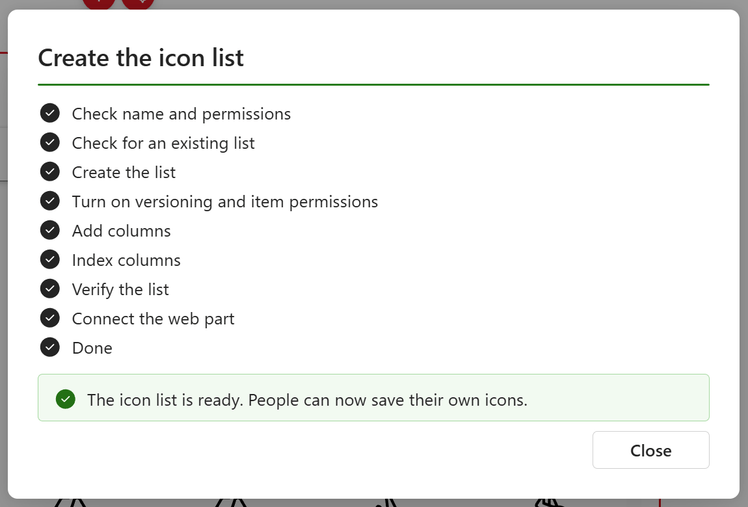
When the list is ready, select Close. The pane now shows the connected list, with Change list to connect another one.
Step 5: Configure the Layout and Appearance section
Expand Layout and Appearance. If the page already has a heading or a banner, turn off Show title. Otherwise, edit the title and its formatting.
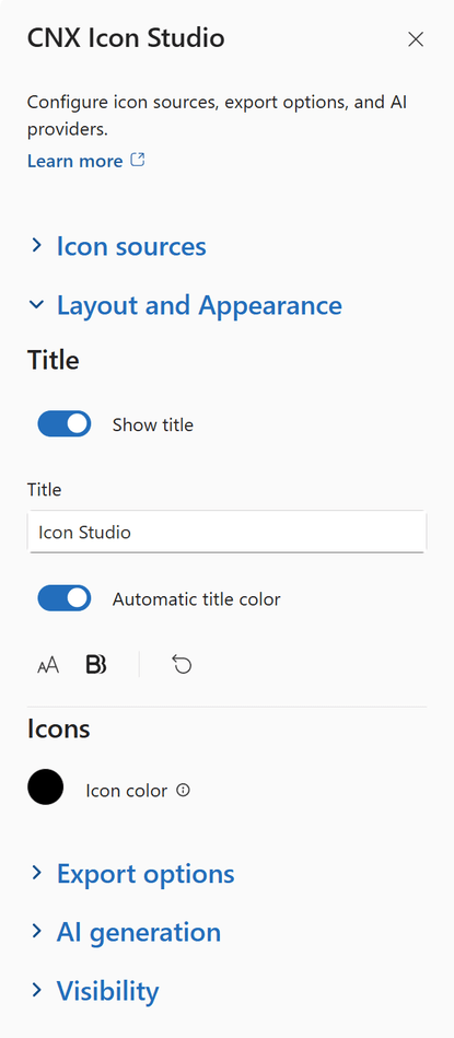
Under Icons, choose the Icon color used in the gallery.
Step 6: Configure the Export options section
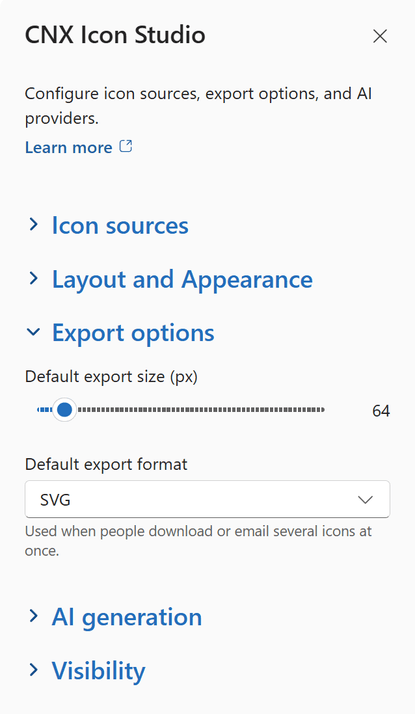
Expand Export options to choose the Default export size (px), from 16 to 512, and the Default export format. They're used when people download or email several icons at once.
Step 7: Configure the AI generation section
Expand AI generation. Show AI icon generation turns the AI features on or off without affecting the rest of Icon Studio.
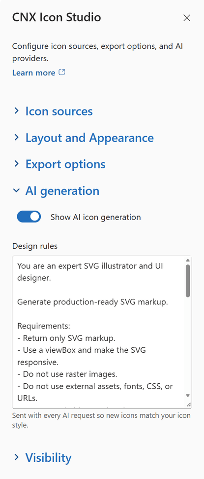
Use Design rules to describe the visual style AI should follow. They're sent with every request, so new icons stay consistent with your collection. The default rules follow the Fluent UI System Icons style.
Important: AI features need the SharePoint AI Gateway, which an administrator connects once for the whole organization with CNX Azure AI Setup. Until it's connected, the AI options stay hidden, and page editors see a message that explains why. Nothing is sent to AI until an editor selects an AI action.
Step 8: Publish the page
Select Publish (or Republish). Your icon library is ready: people can browse, recolor and export icons right away, and add your own icons with Upload and Bulk upload.
Tip: Email uses the Microsoft Graph Mail.Send permission of the package. If an administrator hasn't approved it yet, everything else still works.
Limits
Who sees which icons
- Personal icons are hidden by the web part, not by SharePoint permissions: anyone who can read the list can still open them there. Don't store confidential content in an icon.
- Only people with Edit or Full Control of the list can share uploaded icons as Draft or Published.
AI icons
- AI can make mistakes: check each icon before you share it.
- Each request counts toward the hourly AI limit (30 per person by default).
- Image models can't draw SVG: when you choose one, it draws a reference picture that the text model traces into an icon.
Formats
AVIF export depends on the browser: the format list shows only the formats your browser can create. Uploads must be SVG files of up to 1 MB.
Examples
Brand central
Give everyone one place to find approved icons for presentations, documents and SharePoint pages, in your brand colors.
Department icon sets
Create matching icons for each department or service with AI, tag them, and publish them for the whole organization.
Intranet design
Copy icons as images straight into Teams, Outlook and PowerPoint, or as SVG code for your intranet pages.
Best practices
- Tag every icon with the words people will search for, and reuse existing tags so related icons are found together.
- Keep work in progress as Personal or Draft, and publish only the icons you've reviewed.
- Adapt the Design rules to your brand before people start creating icons with AI.
- Check AI icons at small sizes before you save them: simple shapes stay readable.
Release notes
Initial release
November 2026
- First release, included in CanoeUX SharePoint Web Parts Essentials.
Support
Have a question about CNX Icon Studio, or found something that doesn't work as expected? Contact CanoeUX and tell us what you expected to happen and what happened instead. Screenshots help, and for display or access issues, so does the output of CNX User Diagnostics.
Planning a wider intranet? Explore our SharePoint and digital workplace services.
Free of charge
Support CanoeUX
CanoeUX SharePoint Web Parts Essentials is provided free of charge.
If these web parts helped you save time or deliver value to your organization, consider supporting future development.