SharePoint Web Parts Essentials
 CNX Content Studio
Create polished SharePoint content with AI-assisted design: format it in a familiar editor, design with your own HTML and CSS, or let AI design it for you.
Overview
CNX Content Studio (formerly CNX Rich Text) takes you beyond the standard Text web part. Write and format content in a familiar rich text editor, open the HTML and add your own CSS, or describe what you need and let AI design it: gradient banners, cards, callouts, timelines, step-by-step layouts and eye-catching calls to action.
Everything happens in the property pane. Write in Design, fine-tune the source in HTML, check the result in Preview, start from one of seventeen ready-made designs in Examples, or create and improve content in Design with AI. Your styles apply only to the web part, so they can't break the rest of the page, and scripts are always removed, so it works on sites that don't allow custom scripts.
Use it on home pages, landing pages, announcements and help pages: anywhere content needs more structure and visual impact than plain paragraphs. It also works on single-part app pages and as a Microsoft Teams tab or personal app.
Features
Modern designs the Text web part can't create
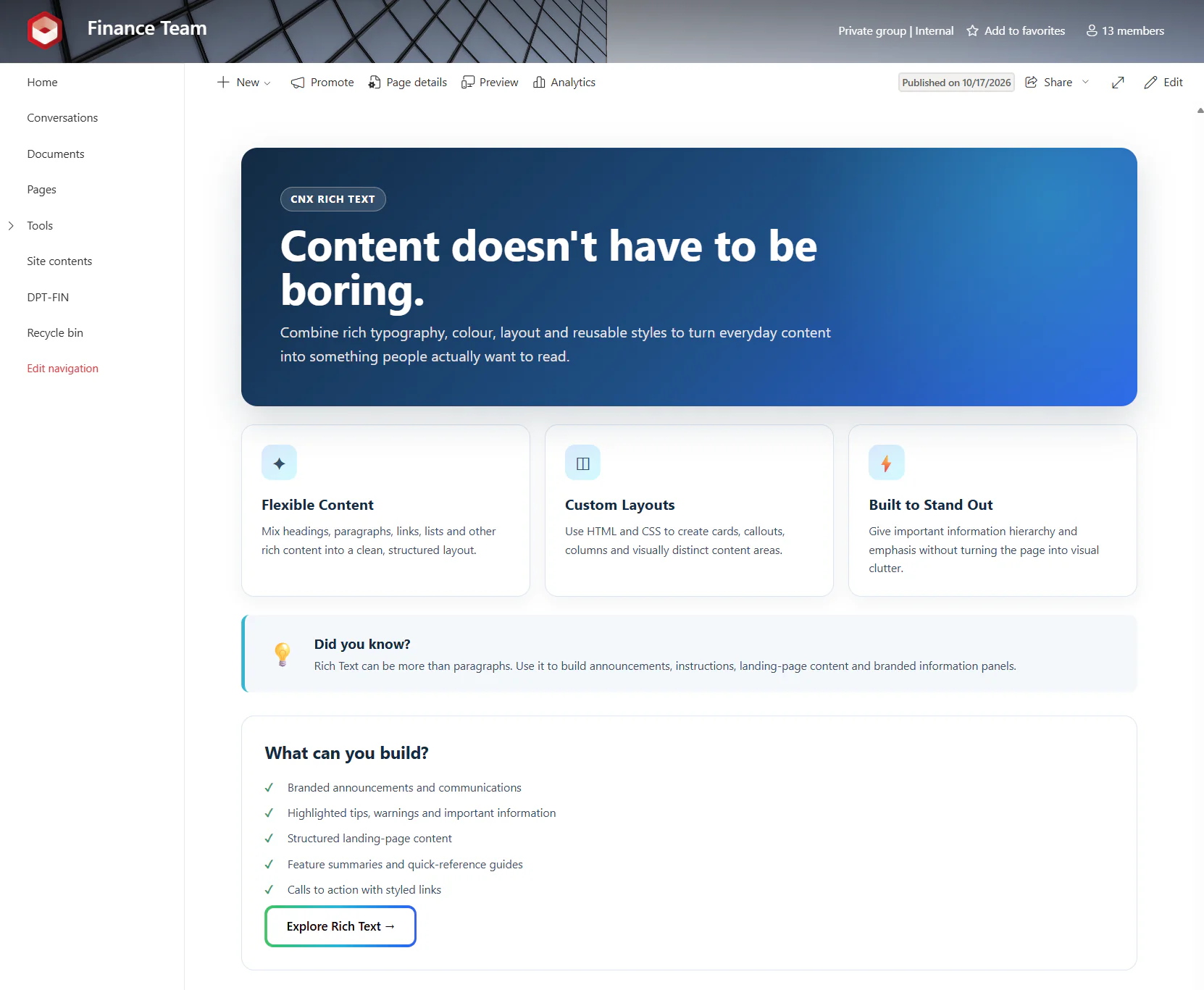
The out-of-the-box Text web part formats text, but it doesn't let you change the HTML behind it or add your own styles. CNX Content Studio does, so you can follow modern design trends right on the page: gradient heroes, cards that lift when pointed at, highlighted callouts, icon lists and styled buttons, built with CSS variables, grid and flexbox layouts, transitions and media queries that adapt the layout to small screens. The demo template below is the first of the examples, ready for you to adapt.
Design with AI
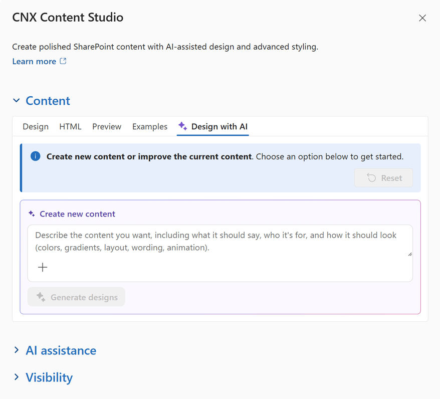
Describe the content you want, who it's for and how it should look, and AI creates two designs to choose from, as live previews. Attach up to four images or documents, such as a screenshot of a layout you like or a Word document with the text, as references. Designs follow your site's name and theme colours, adapt to small screens and respect people who prefer reduced motion.
Improve the content you have
Ask AI to change existing content in your own words, review it for clarity, tone, grammar, inclusive language and accessibility, then fix the issues it finds, or translate it. Every change replaces the draft and can be previewed or undone, and nothing reaches the page until you save.
A complete visual editor
For everyday content, Design has the formatting tools you'd expect: font family, size and weight, bold, italic, underline and strikethrough, text and highlight colours that include your site's theme colours, headings and paragraph styles such as Pull quote, alignment, bulleted and numbered lists, indentation and line spacing. Insert images and links with SharePoint's own file picker, add tables with resizable columns, and undo or redo any change.
Your own HTML and CSS
In HTML, edit the source directly and add a style block of your own. Gradients, CSS variables, grid and flexbox layouts, transitions, hover effects, pseudo-elements and media queries are kept exactly as you write them. Styled content is isolated from the rest of the page: your CSS can't change SharePoint, the page or other web parts, and the site's styles don't override yours.
Seventeen designs to start from
Need some inspiration? Examples offers seventeen ready-made designs, from an animated gradient button and gradient knockout text to an aurora hero, glass KPI tiles, an animated timeline, an FAQ accordion and glowing border cards. Select one to preview it, then open HTML to adapt its text, colours and links to your site.
Safe and readable by default
Content is cleaned before it's shown, including AI designs: scripts, event handlers, embedded frames and unsafe links are removed. The content is stored in the web part itself, so it reads no lists and needs no API permissions. For ordinary content, the text colour adapts to the section's background for the best contrast, and links use your theme colour only when it's easy to read.
Configuration
After the CanoeUX SharePoint Web Parts Essentials package has been deployed to your SharePoint tenant, you can add CNX Content Studio to any modern SharePoint page and start designing your content.
Step 1: Edit the page
Go to the SharePoint page where you want to add the web part, and select Edit.
Important: The Edit button is in the upper-right corner of the page. If you don't see it, you don't have permission to edit the page: ask the site owner or a site administrator for edit permissions.
Step 2: Add a new web part
Hover over the section where you want the web part to appear, and select + Add a new web part. A wide, one-column section gives designs such as card grids the most room.
Step 3: Select CNX Content Studio
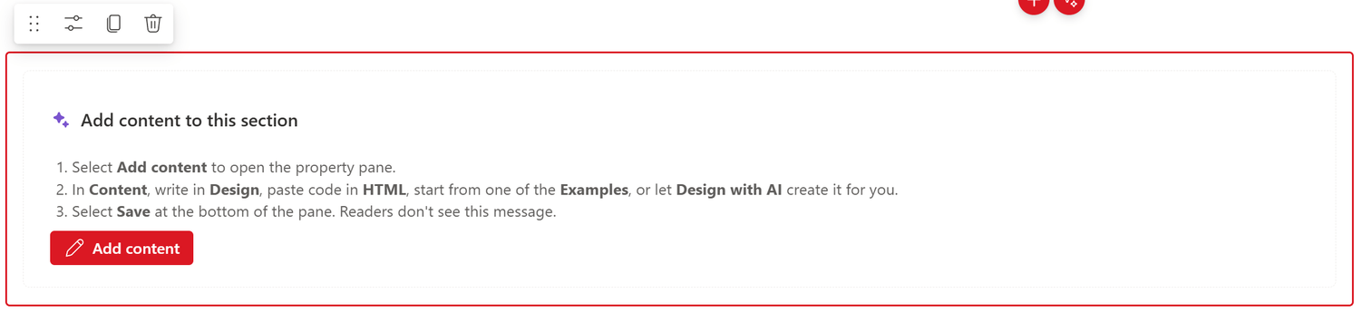
In the web part toolbox, search for CNX Content Studio, and select it to add it to the page. A new web part starts empty: while you edit the page, it shows Add content to this section, and readers see nothing until you save some content.
Step 4: Open the property pane
Select Add content, or select Edit properties in the web part's toolbar.
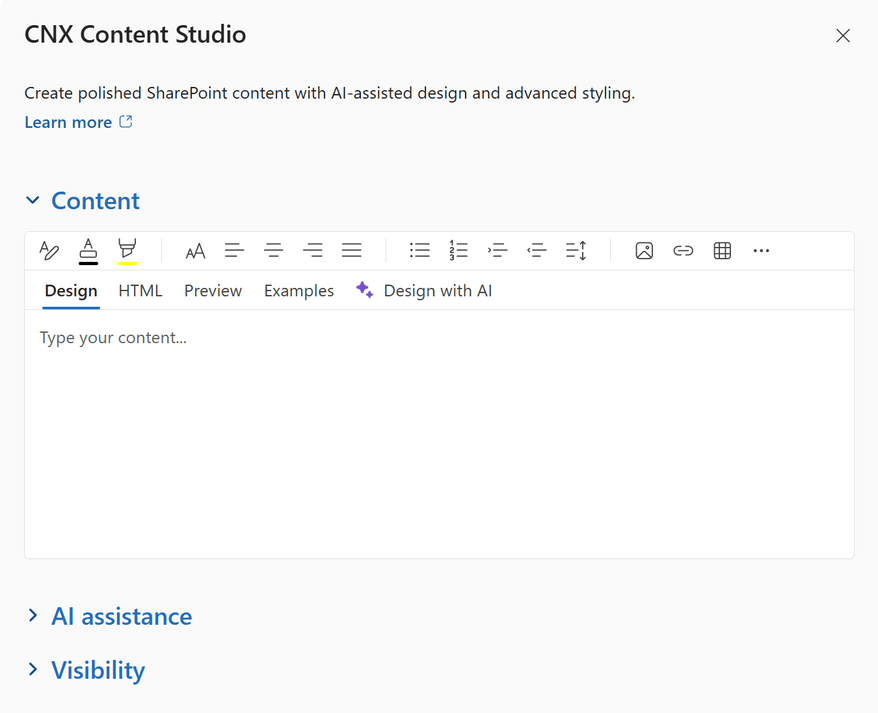
The property pane opens extra wide, so there's room to edit. Its Content section holds the editor, with five tabs: Design, HTML, Preview, Examples and Design with AI. Save and Cancel are at the bottom of the pane.
Step 5: Create your content
Use the tabs of the editor together: write or paste content, adjust its HTML and CSS, check the result, borrow from the examples, or let AI design it.
Available options
Design
The visual editor for everyday content. Use the toolbar to format text, apply headings and paragraph styles, create lists, and insert images, links, tables and horizontal lines. Commands that don't fit in the toolbar move to its overflow menu (...).
Tip: When the content includes a style block, as the examples do, Design shows it read-only and hides the toolbar, so the visual editor can't remove your styles. Edit such content in HTML. To return to visual editing, replace it with ordinary content, such as a simple paragraph.
HTML
Edit the source in a code view with HTML and CSS colour coding. This is where CNX Content Studio goes further than the Text web part: change text and links, adjust colours and CSS variables, or paste HTML and CSS snippets to create modern designs. Style blocks, gradients, grid and flexbox layouts, animations, hover effects and media queries are kept as you write them.
Important: Scripts, event handlers (such as onclick), embedded frames and unsafe links are removed when the content is shown: use CSS for animations and effects. CSS can load images and fonts from other websites, so only use resources from sources you trust.
Tip: Write complete, valid markup. A styled button link, for example, needs both its opening and closing tags to work.
Preview
Shows the content exactly as it will appear on the page, with the same styles, before you save it. Check it whenever you've changed the HTML.
Examples
Need some inspiration? Select one of the seventeen examples to load it into the editor and show it in Preview, then open HTML to adapt it to your content and branding. Browsing the gallery changes nothing. Selecting an example replaces your current draft, but the web part on the page doesn't change until you select Save, and Cancel goes back to the saved content.
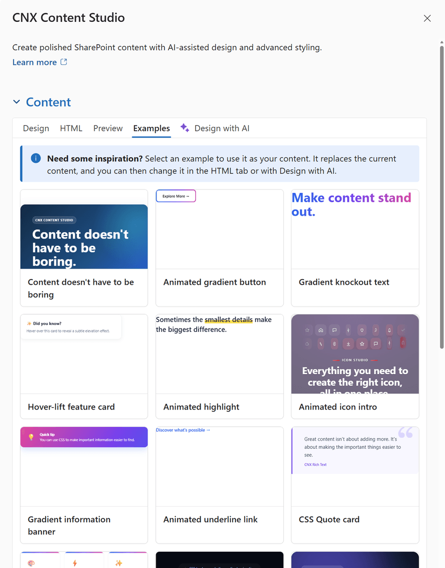
Each example suits common SharePoint content:
- Content doesn't have to be boring: the demo template, with a hero, three cards, a callout and a feature list. A ready-made layout for a site home page or a program landing page.
- Animated gradient button: a call to action for an event registration, a survey or the launch of a new tool.
- Gradient knockout text: a bold title for a campaign, a department home page or a section of a long page.
- Hover-lift feature card: a service, a resource or a team, presented as a card that lifts when it's pointed at.
- Animated highlight: draws the eye to a key phrase, such as a deadline or a policy change.
- Animated icon intro: a band of icon tiles that flip in above a centred introduction.
- Gradient information banner: announcements, maintenance notices and important reminders.
- Animated underline link: links to related pages, policies and resources that stand out.
- CSS Quote card: a leadership message, a colleague's words of advice or one of your organization's values.
- Three-card feature grid: quick links, a service catalogue or the pillars of a strategy.
- Hero headline: an eye-catching welcome at the top of an intranet home page or a communication site.
- Aurora hero with call to action: a welcome with drifting gradient light and two buttons.
- Glass KPI tiles: key figures that rise in one after another, for a dashboard or an annual review.
- Animated timeline: a project's milestones or the history of a team.
- FAQ accordion: frequently asked questions that open one at a time, without any script.
- Shimmer announcement banner: a light sweep across a gradient banner, for news people shouldn't miss.
- Glowing border cards: cards with animated gradient borders that draw attention to key resources.
Tip: The text and figures in the examples are placeholders. Replace them with your own content before you publish the page.
Design with AI
Available when AI assistance is turned on and the SharePoint AI Gateway is connected.
- Create new content: describe the content you want, including what it should say, who it's for and how it should look (colours, gradients, layout, wording, animation), then select Generate designs. Two designs come back as live previews; select Use this design on the one you prefer.
- Improve current content: describe the change and select Send, or select Review content (clarity, tone, grammar, inclusive language and accessibility, then Fix these with AI) or Translate.
- Attach (+): add up to four images, such as screenshots, or documents (Word, text, Markdown, CSV, HTML, JSON or XML) as references. AI uses them for inspiration and never embeds them.
- Reset clears the tab and puts back the content you had before the first AI change.
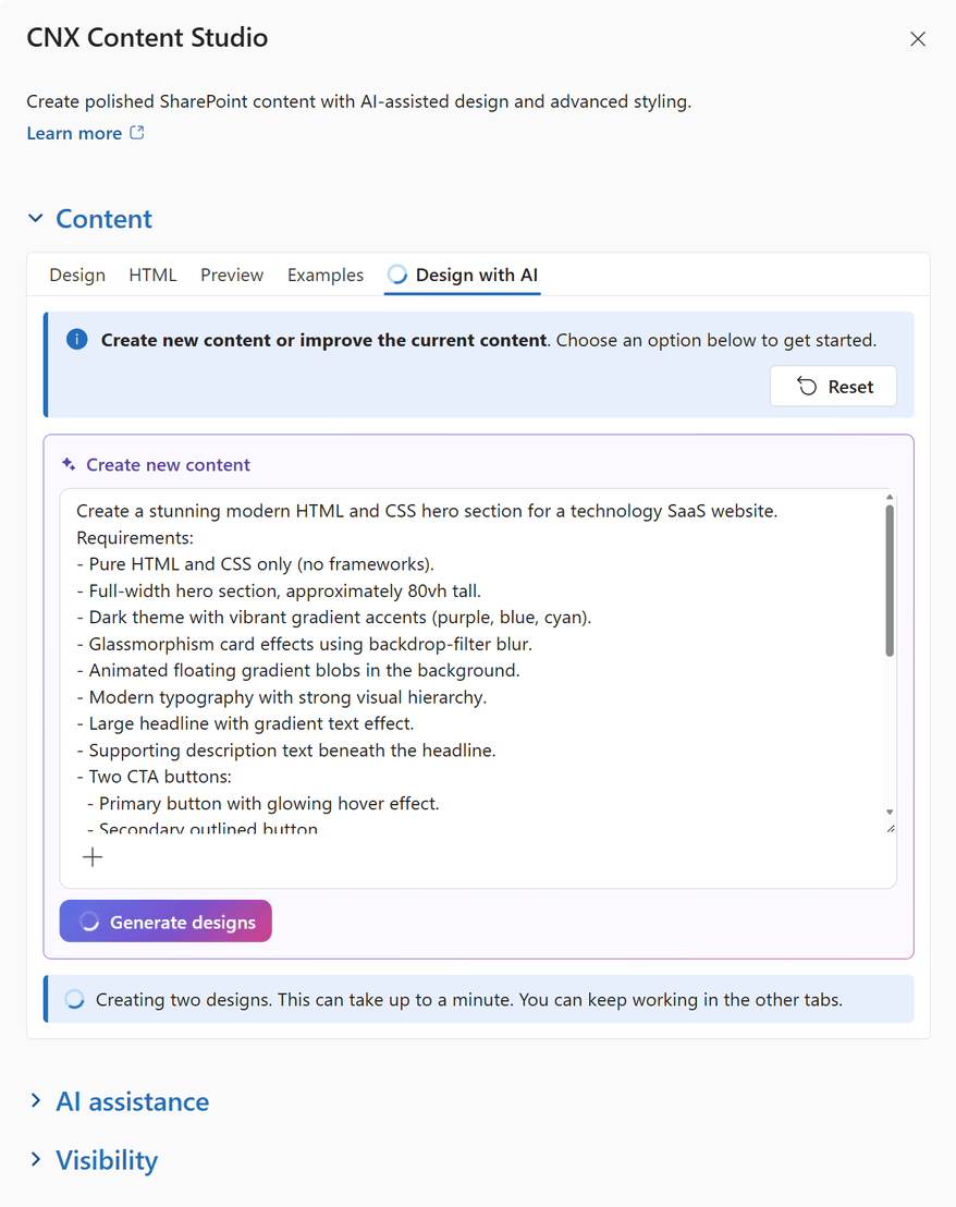
Creating designs can take up to a minute, and you can keep working in the other tabs while you wait. Every AI change replaces the draft, with Preview and Undo buttons; nothing reaches the page until you select Save.
Step 6: Configure the AI assistance section
Expand AI assistance below Content and turn on Enable AI features to show the Design with AI tab to editors.
Important: AI features need the SharePoint AI Gateway, which an administrator connects once for the whole organization with CNX Azure AI Setup. Until it's connected, the AI options stay hidden, and page editors see a message that explains why. Nothing is sent to AI until an editor selects an AI action.
Step 7: Save your changes
When the draft looks right in Preview, select Save at the bottom of the property pane. The web part is updated on the page right away, without reloading it. Save and Cancel become available as soon as the draft differs from the saved content; Cancel discards the draft.
Important: Closing the property pane without selecting Save discards your draft, without a warning.
Step 8: Publish the page
- Select Republish (or Publish, if the page has never been published) to make your changes available to readers.
- Check the published page, on a phone as well as a computer. The examples switch to a single column on narrow screens; make sure your own layouts do too.
CNX Content Studio is now configured and ready to use.
Limits
Editing and saving
- Closing the property pane without Save discards the draft, without a warning.
- Content with a style block can only be edited in HTML. For ordinary content, markup that the visual editor doesn't support is kept only until the next edit in Design.
- The editor's tabs, toolbar and labels are in English.
AI designs
- AI can make mistakes: review every design, its wording and its contrast before you save it.
- Each request counts toward the hourly AI limit set when the gateway was deployed (30 requests per person by default).
- Your site's name and theme colours, your instructions and any attachments are sent to your organization's own SharePoint AI Gateway. The gateway doesn't store or log them.
Links, images and colours
- On the page, links open in the same tab, including links to other websites.
- Images uploaded from your device, up to 1 MB each, are stored in the page itself, which makes it larger and slower to load. For anything but small images, upload the image to a site library first, then insert it from Site.
- The automatic text and link colours follow the section's background colour, but not background images or gradients: check the contrast on such sections. In styled content, your CSS sets the colours, so their contrast and their layout on small screens are up to you.
Examples
Intranet home page
Welcome people with an aurora hero and a short message, then point them to the most-used resources with a three-card grid.
Announcements and notices
Use an information or shimmer banner for maintenance windows, policy changes or deadlines that people mustn't miss.
How-to and onboarding guides
Ask AI to turn a Word document into numbered steps, with callouts for tips and warnings, on a help page or an onboarding site.
Leadership and culture
Feature a leadership message, a quote from a colleague or a company value in a quote card.
Best practices
- Start from an example, the demo template or an AI design, and change its text and CSS variables rather than writing everything from scratch.
- Review every AI design before you save it: check the wording, the links and the colour contrast.
- Use semantic HTML (headings in order, real lists and tables with header cells) so content stays accessible to screen reader users.
- Keep text and background colours at WCAG AA contrast levels (4.5:1 for body text) whenever you set your own colours.
- Make multi-column layouts stack on narrow screens with media queries, and check the page on a phone before you publish it.
- Respect people who prefer reduced motion: turn off animations in a prefers-reduced-motion media query, as the examples do.
- Only use HTML, CSS and resources from sources you trust, and review the page after you publish it.
Release notes
AI features
November 2026
- Renamed from CNX Rich Text to CNX Content Studio.
- Design with AI: create new designs from a description, improve, review and translate content, with images and documents as references.
- Six new examples, and new web parts now start empty.
Initial release
October 2026
- First release, included in CanoeUX SharePoint Web Parts Essentials.
Support
Have a question about CNX Content Studio, or found something that doesn't work as expected? Contact CanoeUX and tell us what you expected to happen and what happened instead. Screenshots help, and for display or access issues, so does the output of CNX User Diagnostics.
Planning a wider intranet? Explore our SharePoint and digital workplace services.
Free of charge
Support CanoeUX
CanoeUX SharePoint Web Parts Essentials is provided free of charge.
If these web parts helped you save time or deliver value to your organization, consider supporting future development.